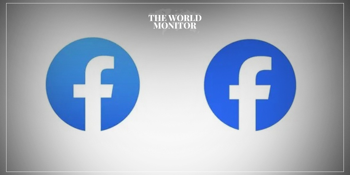
Meta has unveiled a revised version of Facebook’s logo, with a deeper shade of blue and slight adjustments to the lowercase “f”.
The goal behind this makeover was to craft a bolder, more enduring, and electrifying representation of the Facebook logo.
This new design accentuates harmony throughout, making it a prominent aspect of the app’s branding.
A standout feature is the “richer expression of Facebook’s core blue shade”, designed for better visibility within the app and to make the “f” more pronounced.
The phrase, “a richer expression of Facebook’s core blue color”, is an eloquent way of saying the logo now sports a deeper blue.
Although it’s humorous to think about it, it’s understandable why Meta has decided on subtle modifications instead of a complete overhaul of the Facebook logo.
Considering Facebook boasts a staggering 2 billion daily users, any design changes are bound to get immense visibility. It’s clear why Meta has chosen minimal adjustments to an emblem that’s already deeply ingrained in the tech world.
For those nostalgic about the logo’s journey, Meta’s blog post offers a brief video on its evolution, which has been converted into a GIF for easy viewing.
“Using our custom typeface, Facebook Sans, we redesigned the wordmark and logo to create a consistent treatment and improve overall legibility across Facebook,” Meta said.
“Similar to the changes to the logo symbol, these refinements allowed us to build upon the heritage of our identity, while creating a stronger relationship between how the wordmark pairs with the rest of the typeface.”